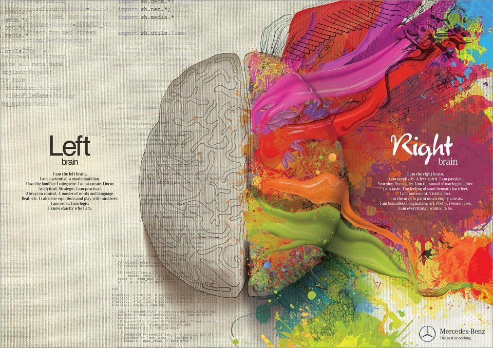
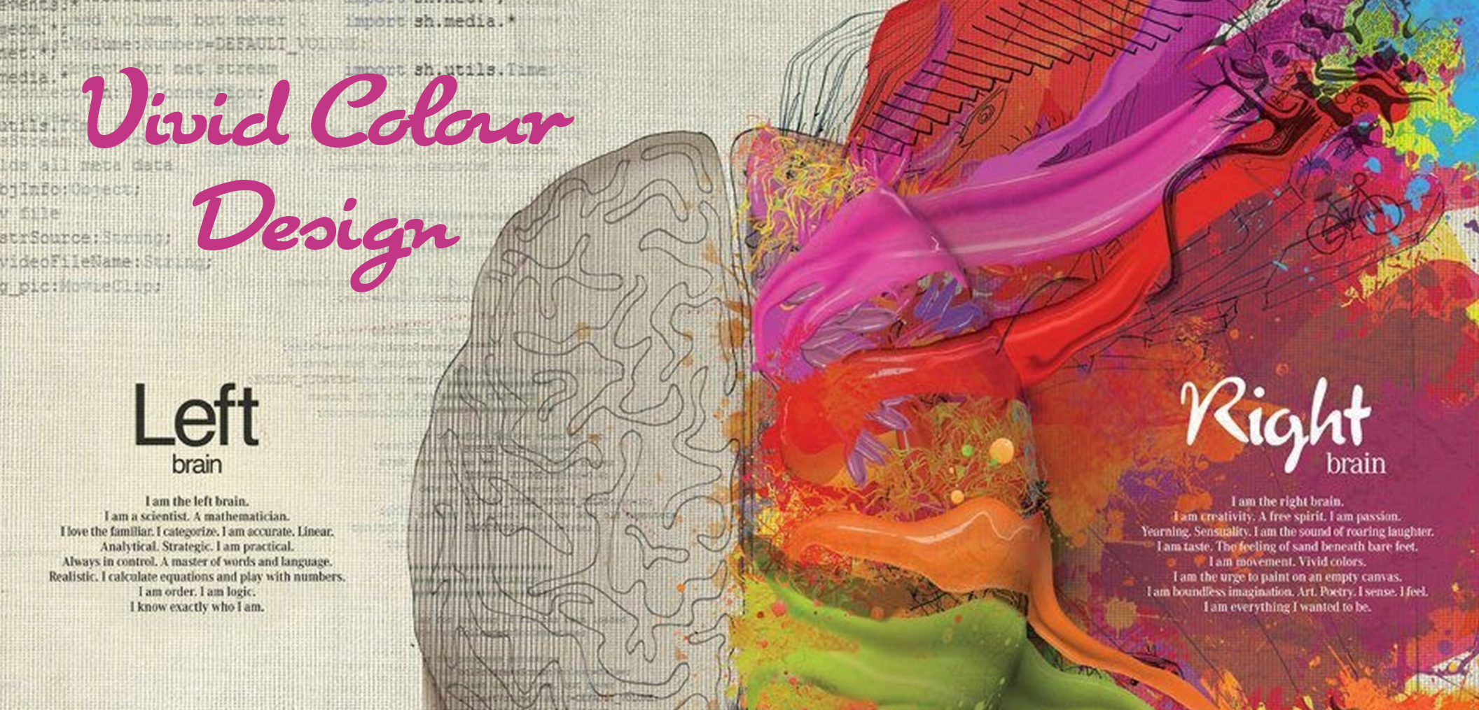
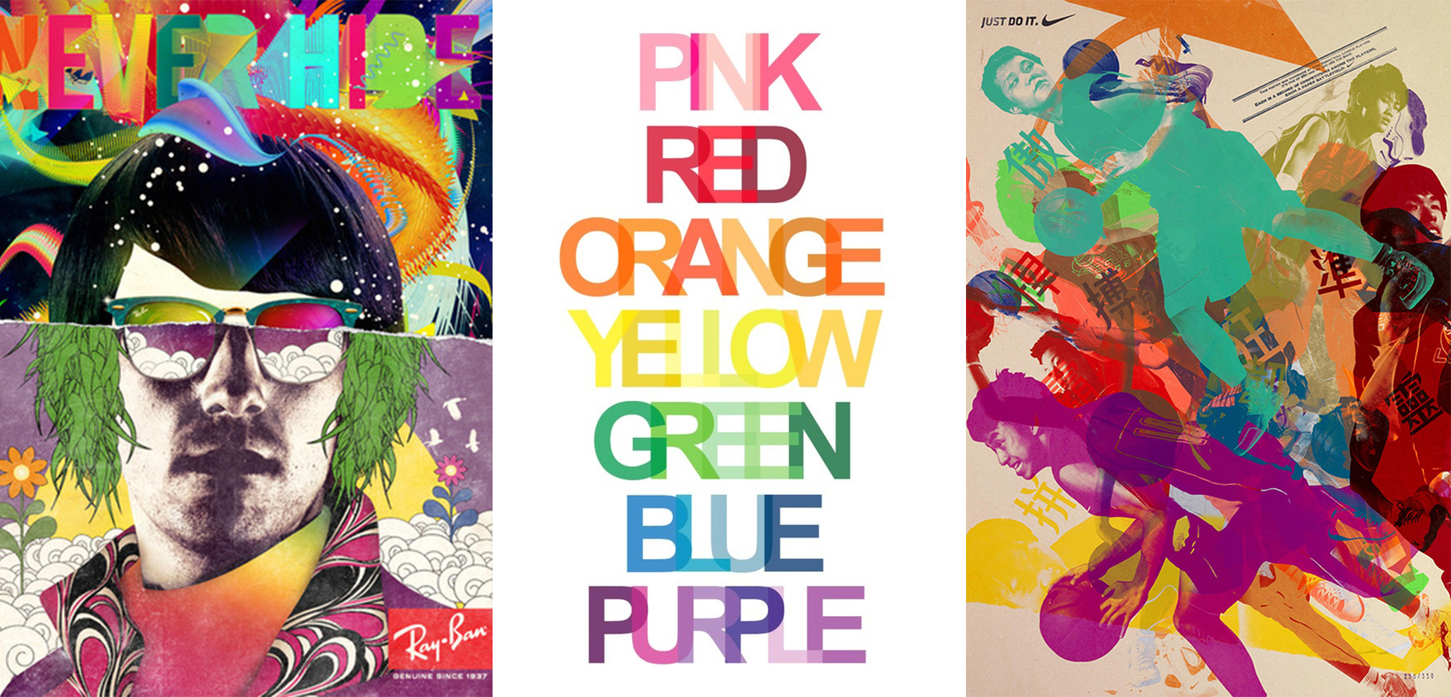
Sometimes the only way to capture the eye is with bold vivid colours. Think of how we are drawn to the cultures of the Asian Subcontinent. The bright sari’s, festival of lights, hanging prayer flags, lush greenery and stunning sunsets. Colours evoke multitudes of emotions – this can be a good thing OR it can overwhelm. Finding a balance is key.
I do find it ironic that in the design world, colour is not used enough. As artists, which many of us designers believe we are, we are timid to add bold and striking colour to our clients designs. Maybe its fear of not ‘appealing to the masses’ or there is too strict of a brand guideline that makes us push the snooze button on colourful design.
As a designer, I try my best to pick brands and clients that best suit my design taste and interests. I have friends in all walks of the design world …. and some design work I just would hate to do (but alternatively a lot of designers would hate to do social media images – not big enough a design process).
Photo credits – here, here, here,

Photo credit here.
Like in interior design, bold colours are used to add to a design not take over. We alway buy the neutral flooring, beige sofa, wood table – but our accent colours can bring life to the space with bright wall paint and wall paper, throw pillows, art. The same is true with colour in the print / digital world. Brands can have the standard guidelines for the branding, letterhead and stationary but this does not have to translate to the marketing material.
All brands should stay on trend, so the customers does not get board of the same old.
Social Media is one of the easiest and best channels to explore colour and push the creative box. There are less rules – and its the best space to express your brand in a bold way.
For more Vivid Colour Design inspiration check out our Vivid Colour Pinterest Board:
Follow Socialee Media’s board Vivid Colour Design on Pinterest.


